Composition and viewpoint
We are learning about position and scale in communicating ideas and this section will cover
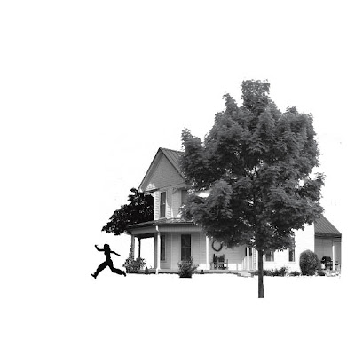
Scale: the relative size of one element to another
Position: The relationship of components to each other and the frame
Contrast: How much tone, texture, colour each element has relative to the other
Shape: The two dimensional form an element takes
Space: The visual distance between elements
of which compositional elements are to be considered, diagonals, horizontals and verticals as well as subjects that float within the horizon.
Exercise:
Illustrating visual space with images of a building, a child walking and a tree.


No comments:
Post a Comment