Saturday, August 27, 2011

Two Other Artists I Admire

I was cruising through the Folio illustrator site and was blown away by two artists who's work although completely different, really resonated with me. Anne Sharp paints in Acrylic. The attention to detail is amazing. This is what I would love to achieve, but wonder if I would have the patience to put in so much detail. It's so perfect.
The next artist, Brendan Kelly, is a portrait artist who is very well know, but he is still an illustrator and his work is fascinating. I visited his website and looked through his sketch books of which there are pages and pages, both portrait and landscapes of the various places he has visited on holiday. I am sure I will be back time and again to look at his watercolours.
I wont be posting for a while as I am moving right after I get back from my holidays. Yes, the big move, Dubai to France.

Illustrators of interest

My tutor, Penny, has come back with some great comments and some good ideas to improve my work. One of the three of the artist she thought would be of interest to me is
Kareem Ilia. I think because of my work in exploring and painting where we experimented with cut outs and colour. Kareem does a lot of cut out with watercolour wash,and I quite likes his use of paper layers in the first image. His work is so simple and so beautifully executed. Although focused mostly on fashion his list of clients internationally is extraordinary.


Two other artist suggested are Gez Fry and Roy Litchenstein for comic book illustration. I have always loved Litchensteins work and saw a number of his paintings here in Dubai during the Art Festival (Wham being one of them). I was surprised to see he was part of the surrealist movement, as I thought of him more as a contemporary.. very modern and exciting.

I thought this was a pretty great description of his work: The ironic Lichtenstein who takes soulful subjects and paints them with cool' by David Sylvester, American Vogue September 1969 and this one:
'Is He the Worst Artist in the U.S.?', Life Magazine January 31, 1964 - For some of America's best known critics and a host of laymen, the answer to the above question is a resounding YES. A critic of the New York Times, hedging only a bit, pronounced Roy Lichtenstein "one of the worst artists in America." Others insist that he is no artist at all, that his paintings of blown-up comic strips, cheap ads and reproductions are tedious copies of the banal. But an equally emphatic group of critics, museum officials and collectors find Lichtenstein's pop art "fascinating","forceful", "starkly beautiful". 
reminds me of the 70's using Letraset
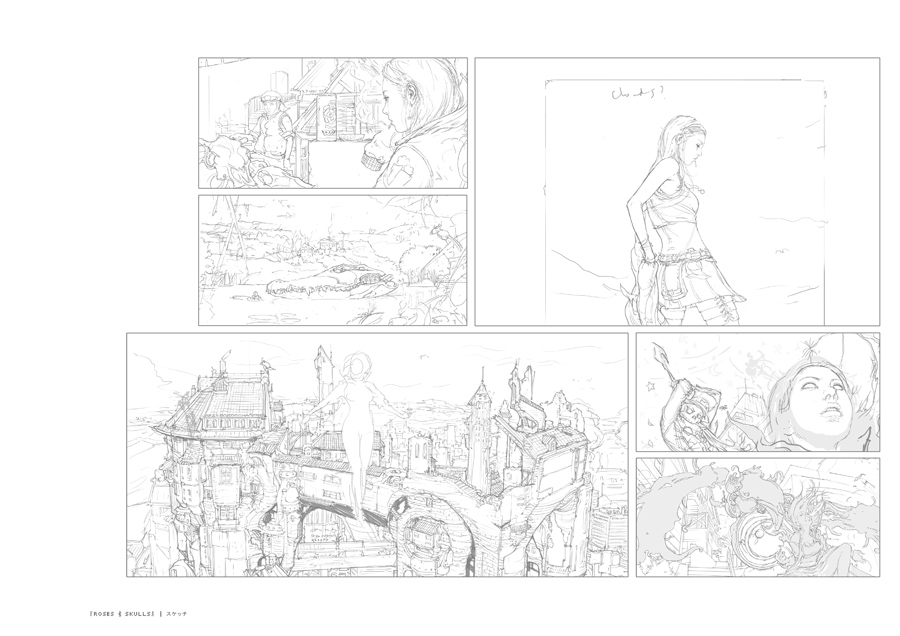
UK-born but now based in Japan, Japanese-British artist Gez Fry applies both hand-drawn and computer-generated techniques to his anime-inspired style. The influence of several big manga artists, such as Masamune Shirow (of ‘Ghost in the Shell’ fame) can be seen in his work, as well as those from traditional Japanese art periods such as Ukiyo-e. I chose a few of the works I really liked including a beautiful sketchbook pencil drawing. 


Friday, August 19, 2011

Image Development Poster

I chose the image of the two boys and decided as they were in the lake, it would be great to give it a watercolour feel.
As I now have my new Wacom tablet, I was eager to try out Painter and Photoshop to see what I could achieve. I'm still learning as I go, so it was very time consuming and I have to look up a lot of tutorials to find out how to get the effects I was looking for.
The watercolour was interesting, but dull and not
really exciting enough for a poster 
I decided to brighten it up with an acrylic rendition
but still not happy as it's still not what I had in mind.

At last, after much messing around I got what I wanted. It's still like a painting, but has a lot more definition. The fish in the headline were an afterthought, but their relationto the story made it a bit more fun.

Tuesday, August 16, 2011

Project:Hierachy in the image

Reading the image:
The image shown is an illustration by Mark Oliver. Looking at the image, it is a delightful children's book illustration, bold and colourful.  Looking it up on line, I find that the book is called Tom's Clockwork Dragon. My project is to look carefully and find out what it is saying.
The main character is the evil dragon laying on the ground with his eyes shut, along with two children who are standing firm in front of him. It appears to be night as it is dark but there is a blazing red light or fire which appears to be coming from the torch the girl is holding. She is also holding a type of sword or lance which signifies that either they have slain the dragon or the dragon is sleeping. There are pieces of armour all around which I must assume were the parts of the clockwork dragon either discarded or broken up. The boy is pointing away, as if to say 'let's go or leave.
There appears to be a throne or an ornate chair that the dragon is wrapped around and some gold coins on the ground, but I cannot make it out so don't know the significance.
The palette of red and blue are very bold, red for the dragon and fire, blue for the ground and lastly a deep purple for the sky, indicating either night or darkness inside a cave.
It's interesting that he has made the fire or red light almost dripping as though it's a cloak protecting the children. There is a lot of texture on the side of the dragon, but unfortunately the image is not clear enough to make out what it is or means. 
The connection between the hot colour and the story is the visual attention it projects, the red fire/light with the glowing yellow centre if stronger and bolder than the red dragon despite both of them being the same colour value. The hierarchy is the red colour, the ground being blue highlighted by the light, and the deep purple the background or night.


Project Visual Properties
Exercise: Image Development
This project is to take an image with a lot of visual content and break it down into its individual subjects. I should choose a word for each subject and to see how breaking it down could alter its original interpretation.
One of these images should be then made up into a poster with added colour and texture and a title with the appropriate typeface.
This is my original photo. I feel there is a lot of energy
happening here
Each clip tells a different story. I am reluctant to write up descriptions on each one as I feel the purpose of the exercise is to extend the narrative through the single word description of how I interpret each image. 

Part 3 Working it out

Composition and viewpoint


We are learning about position and scale in communicating ideas and this section will cover 
Scale: the relative size of one element to another
Position: The relationship of components to each other and the frame
Contrast: How much tone, texture, colour each element has relative to the other
Shape: The two dimensional form an element takes
Space: The visual distance between elements
of which compositional elements are to be considered, diagonals, horizontals and verticals as well as subjects that float within the horizon.


Exercise: 
Illustrating visual space with images of a building, a child walking and a tree.
This grouping is both so horizontally and vertically stable 
that I felt there was no need for a horizon. It gives the sense 
of stability with the tree in front, anchoring the house, but 
the eye follows the movement of the child running out into 
the white space.... the unknown.

I added a horizon to give the feeling of movement. The house is angled 
downhill left.The tree is leaning towards the house and the child is running 
downhill, but even so, her thumb is pointing back up towards the tree.
The eye is almost pulled into a central circle of events with the abrupt 
ending of the horizon cutting off any further visuals.
Without the horizon you don't get the same impression though.

Again, no need for a horizon, although the clild is the star of the image 
snuggled between the blocked up visuals of the tree and house. 
The eye is ultimately drawn to the centre, even though the child's image 
is so small.

Nothing is enhanced to be very large or small here, the interest is in the hill 
and what is at the top. Even with many trees the house is the hero of the image, 
everything leading to the summit.

I have to choose which is my favourite and why. I believe that number 2 is my 
favourite. There is something intriguing about the little child running down the
hill. I like the movement and interaction between the elements.

Tuesday, August 9, 2011

Point of sale continued

I didn't get a chance to finish my last painting before going on holiday. Rather than rush into doing something that might or might not work, I left it until now.
Cherries are such a wonderful spring fruit, so I was having quite a hard time finding fresh cherries, especially here in Dubai, and even thought they were a bit stale, felt that no other fruit worked quite as well depicting spring and summer as the delicious cherry. 
The theme 'cherries from heaven' kept popping into my head, so I thought ok, lets have them falling from the sky rather than on a plate or bowl.
As soon as I have posted these layouts up I will take all the jpgs to the print house for some high res prints just to see how they actually look full size. It could mean a whole new set of work, but then again, it might just work. Lets see.
watercolour of my cherries

At 100% without computer alteration

Slightly enlarged, but I decided not to go any larger unless
I paint an entirely new drawing with more detail.

I like the blue background, but does it work with the green 

with an added drop shadow

Monday, July 18, 2011

POS display cont. posters


I put together some moodboards to get a feel for the season and get a feel of what resonated with me for the illustration. I originally planned to do something in pen and ink, but changed my mind by the end of the moodboard and decided to take the plunge and try to make my fruit and veg as realistic as I could without making it to 'chocolate box' looking.
Autumn, all golds and reds
Summer
My watercolour painting. I chose to do Cox apples
because of the colours. Apples are in abundance in
the fall and there are so many types. They really fill
the shelf space in the supermarket
I added a little highlights and shadows in photoshop
Poster with the branding elements
Poster 2 with strip for supermarket logo and some text
My favourite. I can't wait to see how it comes out full size
on the digital printer.

Saturday, July 16, 2011

POS display cont.

Some label ideas:
In order to plan my poster, I need an identity that will create awareness and drive consumers to purchase fresh produce. With the 'fresh' identity in place, it can not only be used as point of sale posters, but as stickers on prepackaged fruits and vegetables, tags on bundles of loose vegetables or printed on clear plastic bags for loose salad greens or pre- bagged fruit and vegetables. The brief is to create posters for summer and autumn, so my main focus will be to show fruits that are available during those seasons, but does this need to be taken through to the branding?
I realise that the packaging is secondary to the illustrations for the posters, but I feel it's important to go through the whole process and show that every element has been taken into consideration. Anyway, I'm having lots of fun playing in Photoshop and learning new ways to putting it all together. 
spidergram of seasonal fruits and vegetables

Packaging ideas


tags and label ideas


I quite liked the idea of putting images on the tags, however it means both die cut plus 4 colour printing, so budget should be considered. I started with little watercolour sketches to see how it would look with the images however on reflection, I feel they might be a bit too much. I quite like the simplicity of the small plain wrap tag in the bottom picture which could be used like a logo. 
The typeface on the small green and yellow label is much clearer and could be scaled up or down to size, the band changing colour perhaps for different products.
watercolour sketch for autumn 
watercolour sketch for summe


for tags,stickers or printed on plastic

A second version with alternate typeface and some simple tags
Another label: 
I can't help it, I did one more label which I prefer as adding textures and brighter colour adds zing to it, and makes it really stand out.  It's simple and would work any time of the year as a marker for 'fresh' produce.
The oval with Garden Fresh would stand alone as a logo, the 'winner' strip as a subtle sign of quality and 'best of product' line, while the band strip is an optional element which could be used as a paper wrap around prepackaged cartons or trays, or as a design element across the top of packaging ie: printed plastic bags.
After years in the graphic design business, albeit on the management side, I understand about the structure of a pack/branding and its multiple purposes which are:
To create shelf standout and sell the product
To protect and prolong the life of the product
To reassure customers that it's part of a familiar range - fresh, and do more than simply look pretty as it has to stand out on a crowded supermarket shelf. I think this works. 
without texture on oval
Possibly a stronger font face